An
official website of the United States government.
Here's how you know we're official.
An
official website of the United States government.
Here's how you know we're official.
An
official website of the United States government.
Here's how you know we're official.
An
official website of the United States government.
Here's how you know we're official.
An Art and Science
Cartographers in NOAA's Office of Coast Survey, Marine Chart Division practice the art and science of designing, compiling, updating, and distributing nautical charts. Nautical charts are a special type of map specifically tailored to the needs of marine navigation. Charts show water depths and the delineation of shoreline, prominent topographic features and landmarks, aids to navigation, and other navigational information. A nautical chart is a work area on which the navigator plots courses, ascertains positions, and views the relationship of the ship to the surrounding area. It assists navigators in avoiding dangers and arriving safely at their destination. When a ship grounding, collision, or other marine accident occurs, the nautical chart in use at the time is a critical legal record used to assist in reconstructing the event and assigning liability.
NOAA cartographers use sophisticated software and techniques to produce charts to exacting specifications. Many processes are routine and are applied in an unchanging, systematic manner. However, every chart and every piece of source material to be compiled onto a chart is a bit different. Thus, cartographers are also often called upon to make judgments, based on their years of training and experience, regarding which features to depict on a particular chart, how to portray them, and how any compilation may affect the portrayal and interpretation of other features on the chart.
NOAA has completely transitioned its nautical chart production system, which is now focused on creating and maintaining Electronic Navigational Charts (ENC). This digital, vector chart format is specified by the International Hydrographic Organization and is made by nautical chart producing nations around the world. NOAA's publication of traditional paper nautical charts ended in 2024. Paper charts, derived from NOAA ENC data, may be created by the public with the NOAA Custom Chart application.
Nautical charts (as do all maps of any portion of the Earth) graphically depict the spherical Earth on a flat surface. The "flattening" is accomplished by projecting the positions of Earth's features onto a surface that can be flattened. For nautical charts, this is most commonly done by mathematically projecting spherical positions onto a cylinder. The cylinder may then be "unrolled" into a flat surface, resulting in a rectangular map.
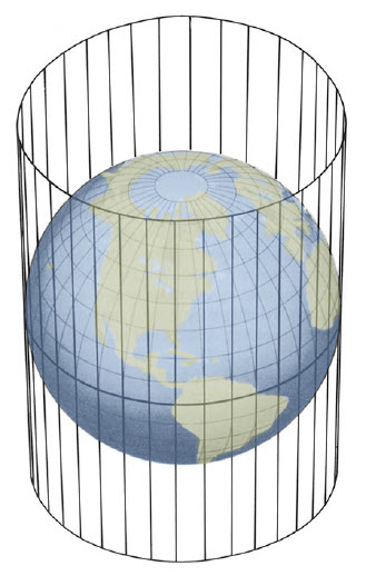
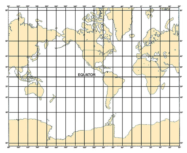
The rectangular Mercator projection was first presented by the Flemish geographer and cartographer Gerardus Mercator in 1569. Most nautical charts use the Mercator projection, because any straight line drawn on a Mercator chart is also a line of constant course, also called a rhumb line or loxodrome. This makes determining the direction to steer a ship over a course plotted on the chart a straightforward task of measuring the angle directly from the vertical meridian lines on the chart. Electronic Chart Display and Information Systems (ECDIS) and many other navigation systems that use and display ENC data present it using a Mercator projection.
The Ever-Changing Marine Environment
Storms affect the configuration of barrier islands and other shorelines. River deltas deposit silt, changing coastlines and the depths of channels and harbors. Buoys and other physical and virtual aids to navigation are installed or moved to increase navigation safety in our ever-changing waters. Channels and harbors are dredged; piers, wharfs and other port facilities are added or improved; marinas are built or reconfigured. Regulations for recommended routes, vessel traffic separation schemes, anchorages, and restricted areas are approved. Bridges over navigable rivers and channels are built, and pipelines and power or communication cables are laid below them. These are just some of the thousands of changes that must be updated on nautical charts annually.
Coast Survey receives information about these changes from scores of source data providers, which include other federal, state and local government agencies, national and international regulatory organizations, private companies, professional organizations, and private citizens. Every chart does not change every week, but every week Coast Survey releases updates to those that have.
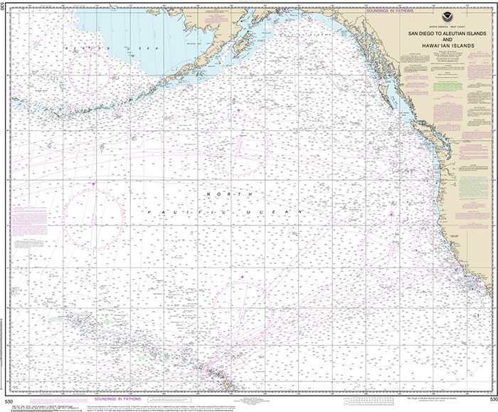
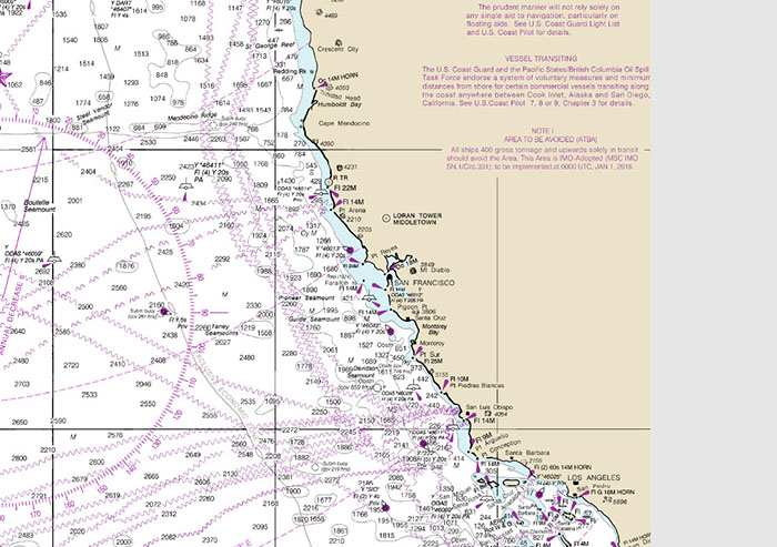
A Chart Scale for Every Navigational Purpose
More detailed (larger scale) charts are required when navigating close to shore, where shoals and other dangers to navigation are more numerous, and within ports, where knowledge of the location and characteristics of channels, buoys and other aids to navigation, piers and other port facilities is vital to safely navigating to and from a ship's berth. Thus, nautical charts are created in several scales. NOAA nautical chart scales range from 1:2,500 to 1:10 million. Charts are often categorized into the following six groups by scale (from largest to smallest scale), Berthing, Harbor, Approach, Coastal, General, and Sailing Charts. These names also hint at the chart scale's intended purpose.
Generalization
New information is usually applied to the largest scale charts first. The depiction of geographic information is then generalized for portrayal on successively smaller scale charts. This is necessary, because smaller scale charts show larger areas on the same amount of paper (or pixels) as larger scale charts. Cartographers use several techniques to accomplish this, such as:
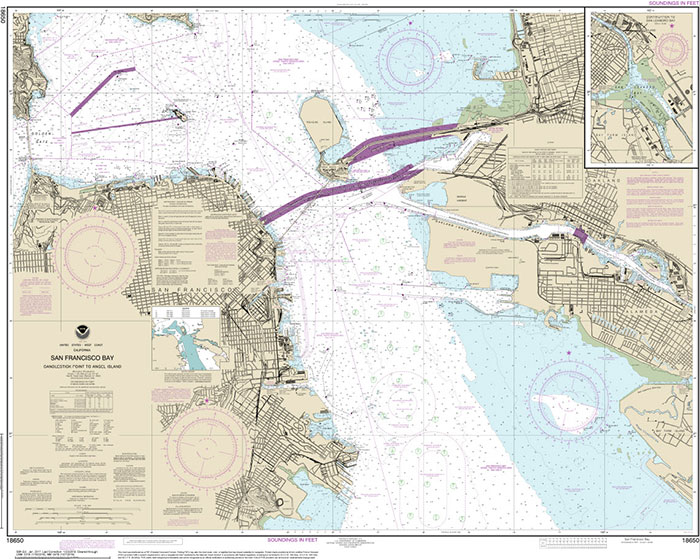
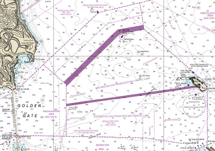
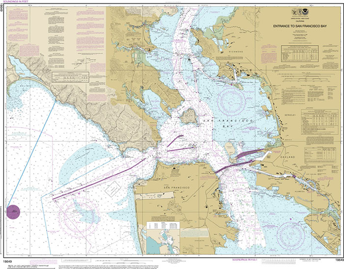
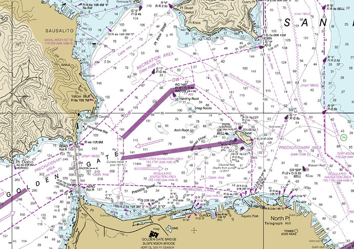
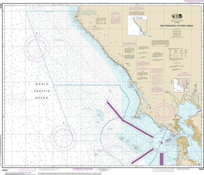
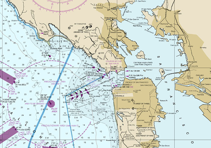
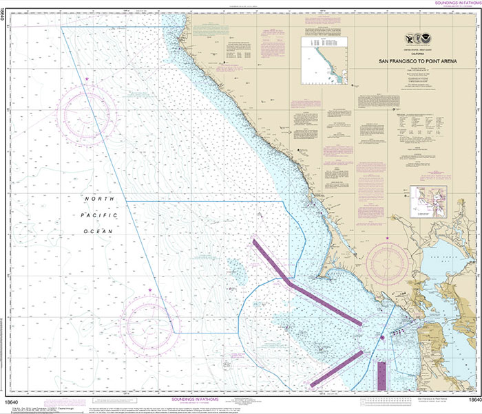
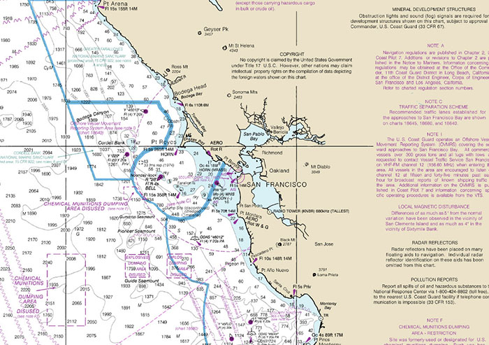
The pairs of images below show the area between San Francisco's Golden Gate Bridge and Alcatraz Island on successively smaller scale charts. These are historical images of NOAA traditional paper nautical charts, which have now been discontinued. The image on the left shows the entire extent of each chart. The image on the right shows the increasingly generalized portrayal of the same area on a ten-inch wide section of each chart.